

Avoid the AI Aesthetic
You ask your favorite agent to generate a design for your exciting new product. It churns for a while, and then your shoulders drop a little when you see it—that telltale AI design that looks like every other website on the planet.
Purple or indigo accents, Inter everywhere, a centered hero with two buttons, identical feature cards, untouched component defaults, decorative glows, and vague promises such as “Elevate your workflow” all contribute to the feeling. The details vary, but they all feel like the same product.
Users have grown exhausted with these designs, and they deserve better. Developers don’t really want to build designs like this either. They even scour Reddit for ways to avoid it. But agents tend to jump right into the same templated territory.
Why does this happen? Blame Tailwind UI. Okay, I’m kidding. But also, not really. Tailwind’s creator, Adam Wathan, even apologized for turning AI-generated sites purple. Anthropic describes this as distributional convergence: without direction, models tend toward high-probability choices.
So in practice, even if you get past that and tell your agent “no purple” or “no Inter,” it tends to move to another set of defaults that other agents follow too: cream and terracotta, acid green on black, newspaper layouts, and so on.
The second big reason is that we review generated code more diligently than generated designs. Builders spend a lot of time iterating toward the right implementation or architecture. With design, people typically accept the generated result, make a few small tweaks, and stop there.
The flip side is good news: models are highly steerable. Give them direction and they leave the center.
Before I go on, I should note that full-blown design tools like Claude Design offer much more flexibility and control and are built specifically for this purpose. But many builders find them to be overkill. They don’t want to go through an entire design app just to generate an initial design for their product. They want to stay in the terminal. If that’s you, this post is for you.
Design iteration: Push the agent(s) further
Treat design the way you already treat code: generate options, look at them critically, and refine.
Divergent exploration. Challenge the brief, then give it to several models or separate agent sessions. Keep those attempts independent so they do not anchor on one another. Require genuinely different structures, hierarchies, typography, density, and personality—not palette swaps—and include one wildcard that may question the workflow itself.
Clarify criteria, then converge. Define what matters for this product—task clarity, hierarchy, density, accessibility, responsiveness, and implementation fit. Then render the directions side by side, choose one against those criteria, record why it fits, and iterate within it.
Adversarial review. Once the direction is coherent, ask fresh-context reviewers to attack it from distinct perspectives: the user’s task, visual hierarchy, accessibility, skeptical first use, and implementation constraints. Each reviewer should identify the most consequential weakness and propose a concrete correction.
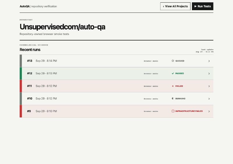
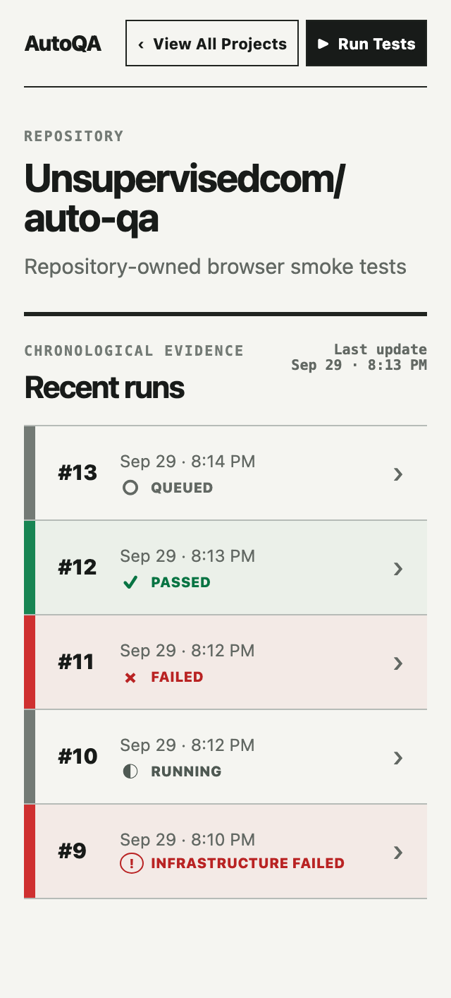
Synthesis and verification. Do not vote or average the reviews together. Preserve the chosen direction, apply the corrections that strengthen it, reject conflicting advice explicitly, and verify the result with real states, content, interactions, and viewport sizes.
I’m going to walk through how I used this process to iterate on a design for a product I’m prototyping called AutoQA. It’s a simple app for launching QA runs and monitoring outcomes.
Its existing design came from only a few basic iterations when I first built it—mostly asking for something “dark and sleek”—so the near-black treatment partly reflected my own prompt. The underlying problem remained: I accepted a plausible visual treatment and kept building.
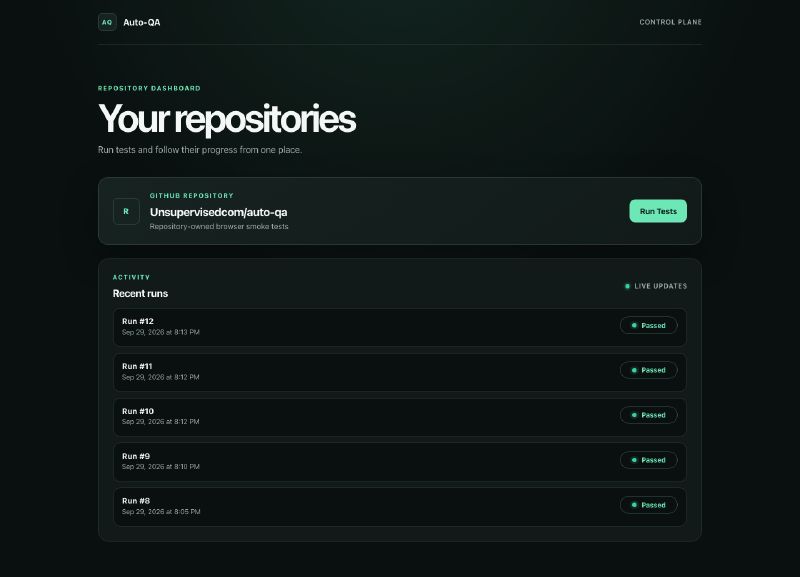
The baseline looks polished, but its visual choices are not meaningfully tied to the needs of a QA tool. They are broadly “average good”: near-black with one bright accent, all-caps labels, a large sparse heading, rounded containers inside rounded containers, glowing dots, and status pills. The same treatment could have been applied to almost any developer SaaS dashboard.
More specifically, green is the wrong accent color for the surrounding interface. In a QA tool, green already has one critical job: communicating a passing outcome. Spending it on buttons, decorative glows, and general chrome weakens the most important signal on the page. Green should mean passed. Everything around it can remain neutral.
First pass: Divergent exploration
I generated four directions with different visual stances: operational, evidence-oriented, calm and editorial, and an attempted wildcard.
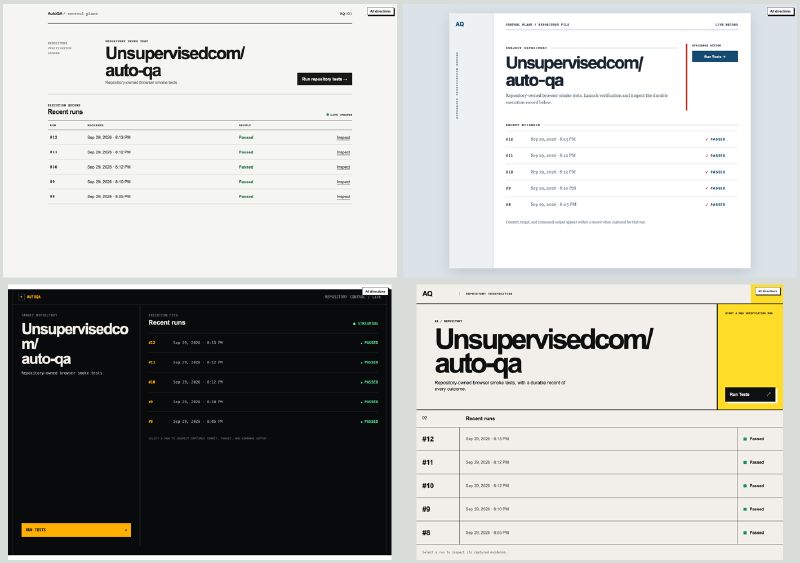
The point wasn’t to choose the prettiest color scheme, so I compared them in grayscale first—structure, density, and hierarchy had to carry the design.
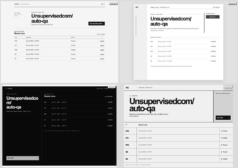
A few decisions became obvious once the options were visible:
Reserve color for meaning. This is a QA tool. Failure red and pass green should dominate at a glance—even when you squint. One direction used red decoration beside passed runs, so it failed immediately. The rest of the interface should be neutral, and status must still be clear through text and shape.
Give the work enough room. Another direction put the Run Tests action in a permanent side column, compressing every run row. The action matters, but the results are the primary evidence surface.
Responsive is not the same as stacked. Every option fit at mobile width, but that alone did not make it mobile-friendly. Starting a run and opening a previous result still need to work clearly on a small screen.
Simple product logic beats visual novelty. These judgments were not exotic design insights. They followed directly from what the tool does.
Concrete options made those ideas easier to see and explain. Books such as Adam Wathan and Steve Schoger’s Refactoring UI help developers build the vocabulary—hierarchy, spacing, contrast, and color—but comparison gives that knowledge something specific to react to.
Second pass: Clarify criteria
All four designs still had nearly identical content and interaction models. That was not meaningful convergence. My brief had required every option to preserve the existing repository header, action, and run list.
Some of those constraints came from earlier LLM-led implementation decisions rather than validated user needs. By freezing them, I made it impossible for the wildcard to question the experience itself.
Before generating another round, I clarified the criteria:
Which constraints reflect the real user task?
Which simply describe the current implementation?
What may the wildcard change—visual treatment, information hierarchy, or the workflow itself?
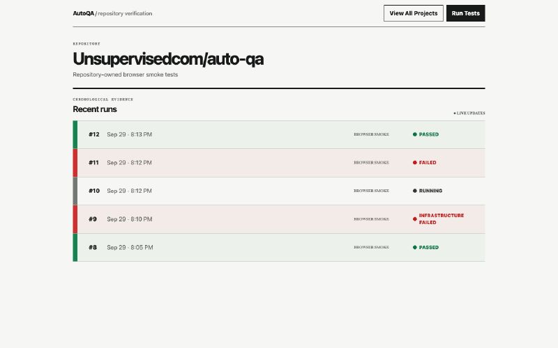
A later wildcard organized the page around the latest outcome rather than the run list. That was a genuine UX alternative, but the execution made PASS comically large. It was useful because it showed a boundary, not because it deserved to win.
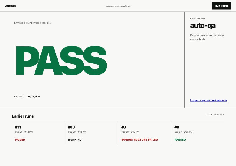
I passed on that execution. The direction I took into adversarial review was a neutral, full-width run history with semantic status.
Third pass: Adversarial review
Once we had a general direction, the next risk was getting stuck in it. I ran five parallel fresh-context reviews to find opportunities the current direction might hide.
Three models split the roles: openai-codex/gpt-5.6-sol:high examined the QA workflow and wildcard alternative; anthropic/claude-sonnet-5:low covered interaction, accessibility, and implementation; and openai-codex/gpt-6-luna:high reviewed hierarchy, design logic, and theme. They suggested several minor changes that improved the direction.
The wildcard critique was more consequential. It proposed organizing the product around distinct unresolved problems rather than chronological runs. I did not adopt that model because it depends on unproven assumptions about grouping failures and knowing when later runs resolve them. But it changed how I thought about the layout: the primary unit may eventually be a problem needing attention, not a run that happened.
Functional or UX-divergent ideas are especially valuable. Instead of iterating only on small choices such as fonts and colors, we should review the different ways the product could solve the problem. This is the right stage to do that—after a direction is concrete enough to critique, but before the design is locked. Otherwise, both people and models can reinforce the same assumptions through every later iteration.
Try it yourself
The next time you have an agent generate a design for you, don’t stop at the first pass. Take a little time to iterate. A little goes a long way.
Each time you do this, you’ll find slight variances in the process that work best for you.
Bit by bit, you’ll find your own aesthetic.